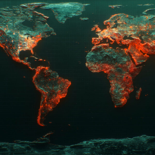
1. Where is the recent Ebola outbreak?

Where the Ebola outbreak has spread, infographic by the New York Times
“Nearly 1,000 people have died and 1,800 have become infected in West Africa.” It’s the worst ever outbreak of Ebola, affecting Liberia, Sierra Leone and Guinea primarily, but has spread to other countries in recent months.
On 8 August, the World Health Organization declared the outbreak a “Public Health Emergency of International Concern”.
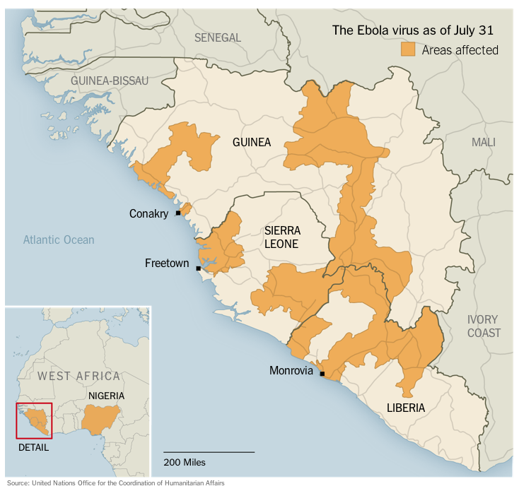
2. What’s the background of the virus?
A trackmap of Ebola, infographic by Africa Spring
The virus was first discovered in 1976, in an outbreak which up until now has been the worst on record. There have since been five different strains of the virus.
3. How did humans get it?
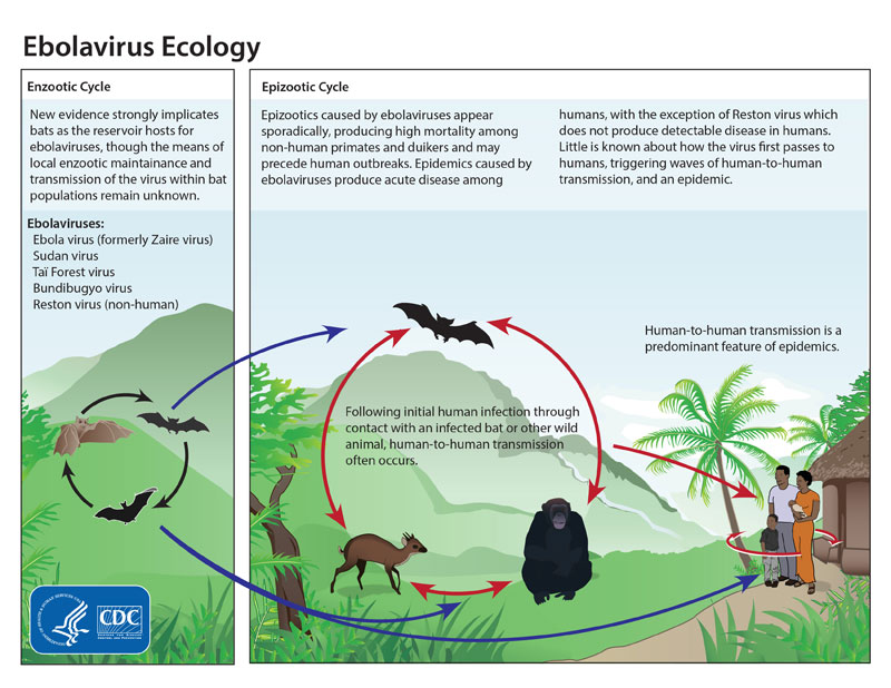
How Ebola infections reach humans, infographic by the CDC
Ebola is contracted through close contact with the blood or other bodily fluids of infected animals. In Africa, infection has been documented via chimpanzees, gorillas, fruit bats, monkeys, forest antelope and porcupines. But very little is known about how the virus initially transfers to humans.
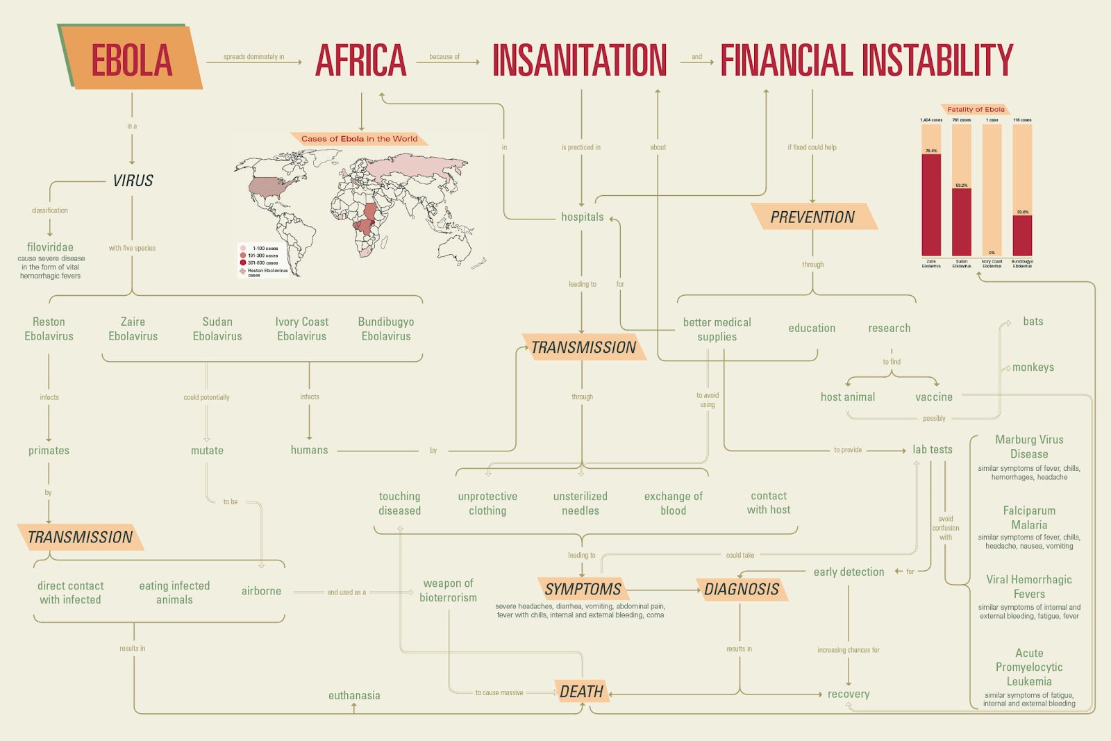
4. How does it spread?
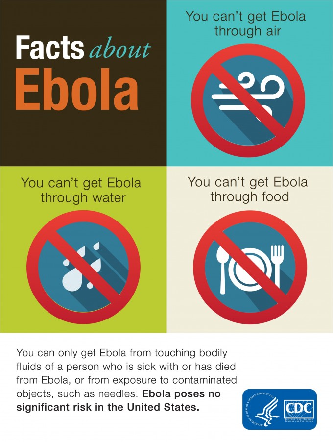
Infographic by the CDC
5. What else do I need to know?
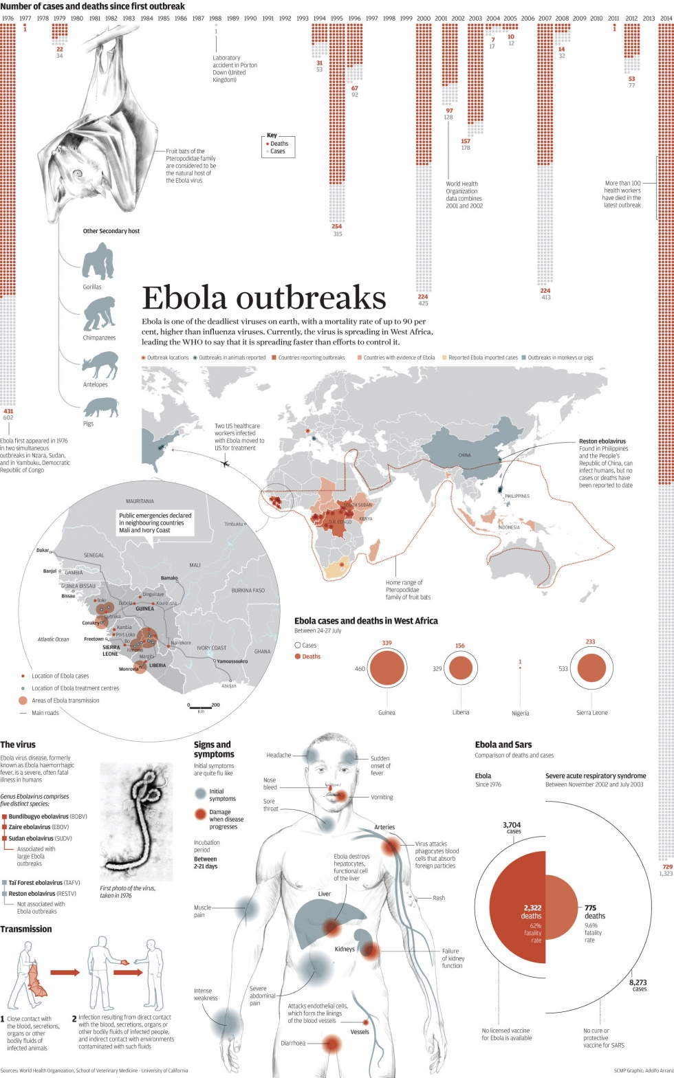
Infographic by the South China Morning Post.
For more information including advice for travellers and the global response to the current outbreak, visit the World Health Organization Ebola portal.