Here’s a collection of some of the best data visualizations on global literacy, mortality, birth rates and more that will help put some of the biggest issues surrounding poverty today into perspective. The good news: Extreme poverty is declining, and life expectancy and incomes on the whole are on the up and up. The bad news: We still have a lot of work to do!
1. Changes in Life Expectancies and Incomes

Hans Rosling’s Gapminder project has long been one of the best data visualization tools for understanding how poverty and welfare are changing. Countries’ life expectancies and incomes per person have increased significantly in the past two centuries. This is true for every single country of the world, though needless to say there are some countries that have developed more rapidly than others. Notice how in 1800 the world starts as a clump of consistent figures. But as time progresses, the inequality between countries increases.
2. The World’s Remaining Extreme Poor
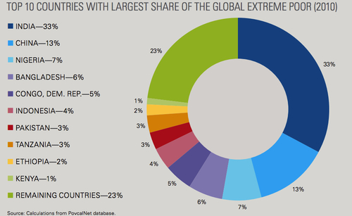
Extreme poverty is most commonly referred to as those making under USD $1.25 a day. This statistic is most often brought up to address how there remain areas in the world where people suffer from extreme lack of resources, and are likely stuck in the poverty cycle.
According to a World Bank Report, the nation with by far the highest existence of extreme poverty is India, followed by China and then Nigeria. These are perhaps unexpected countries to encompass the majority of the remaining extreme poor, for they all have relatively high GDPs and boast concentrated sectors of rapid industrialization. Notice how the top ten nations listed are all in Asia and Africa.
3. The World’s Access to Energy
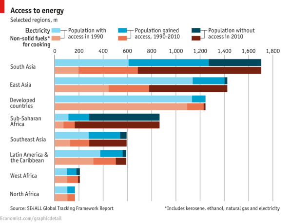
ONE just worked tirelessly to get the Electrify Africa Bill passed in the House. Why focus on Africa? Because as you can see from the dark blue coloring, Sub-Saharan Africa is by far the region with the least access to energy. In 2010, the percentage of sub-Saharan African people who lacked proper access to energy was well over 50 percent. Limited or no access to energy has serious implications. Without energy to light up a house, heat a house, refrigerate food or recharge a phone, necessary steps towards improving education, income and health become much more difficult.
4. The Dwindling of Extreme Poverty
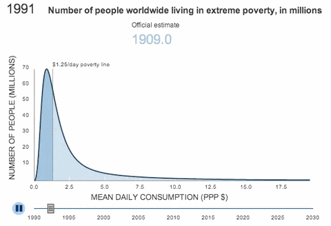
The Brookings Institute designed this graphic to show exactly how quickly the number of people living in extreme poverty in the world are disappearing. Starting in the early 2010s, figures turn to predictions of the future, with the green area demonstrating the worst case scenario for future levels of extreme poverty, and purple demonstrating the best. As evident, the number of people (in millions) that are living in extreme poverty is falling dramatically, and all predictions expect a continuation of that decline. Mean daily consumption here is measured in purchasing power parity to allow for a better comparison across nations and regions.
5. The World’s Literacy Rates
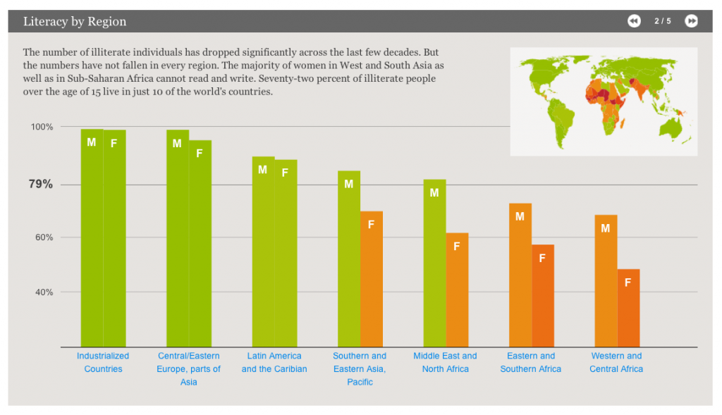
What regions would you expect to have the highest or lowest literacy rates? What are the differences in men and women’s literacy rates? The graph above answers just these questions, showing how “industrialized countries” have near total literacy, where as the MENA and sub-Saharan African countries still have large sections of their population unable to read or write.
The gender gap in literary rates grows more and more apparent with lower total literacy rates. This visualization is merely one graph of a more interactive copulation of data measuring worldwide education by Gregor Aisch, a graphics editor for The New York Times. His additional graphics also depict school enrollment ratios since the Millenium Development Goals were implemented and expenditures on education versus the military.
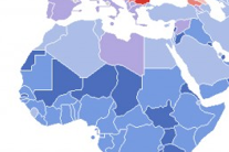
6. National Population Growth Rates
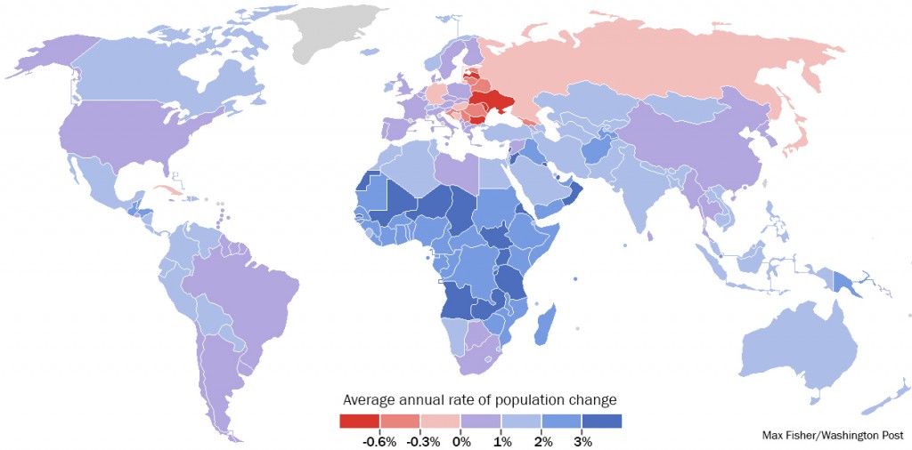
The world’s population is always changing drastically, with some countries growing rapidly and others shrinking in population size. The Washington Post created this map to show just which countries are growing faster and which have the most negative growth. There is indeed a trend of countries with higher GDPs growing slower or stagnating, while the poorest countries are often the ones growing most rapidly.
This is largely due to the remaining high fertility rates in developing countries even as mortality rates are falling, resulting in enormous population growth. Africa has the most countries with high growth, while Eastern Europe, Russia, and Japan all have shrinking populations.
7. Forecasts of Population Growth
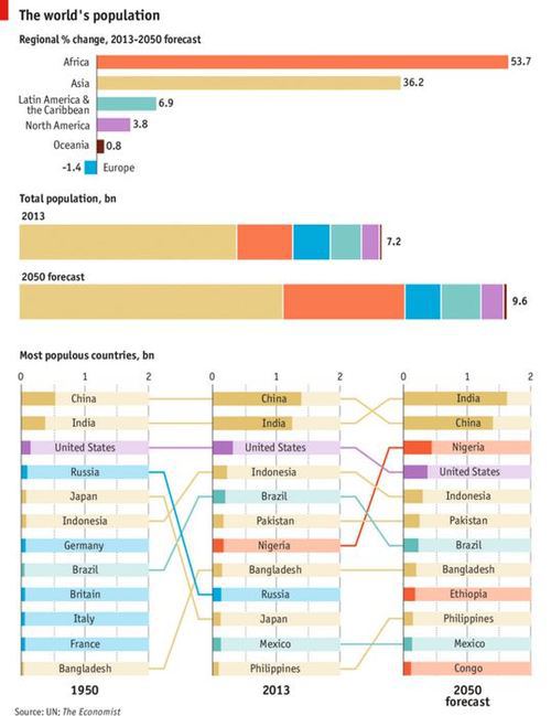
This visualization is a little trickier to interpret, but it certainly shows how the world is changing. As can be seen at the bottom of the graphic, the majority of the most populous nations in 1950 were in Europe, with China and India sitting atop the list. Today, we see the South American nations of Brazil and Mexico enter the top 12 most populous nations, along with the African nation of Nigeria. The only European nation that remains is Russia.
The forecast for 2050, then, includes 3 African nations, no European nations, and India has replaced China on top. The regional percentage changes in population show how Africa and Asia are predicted to far and away lead the growth. According to the Economist and the ICEF Monitor, “more than half of the extra 2.4 billion people in 2050 will be African. India will swell to 1.6 billion people; it is on track to overtake China in 2028.” As Thomas Malthus can tell you, predictions on population can be tricky. But if the world’s growth rates were to continue as they are, the distribution of people in the world would be quite different from what we see today, and extraordinarily different from what we saw a half century ago.
8. The Relative Sizes of Africa’s GDPs
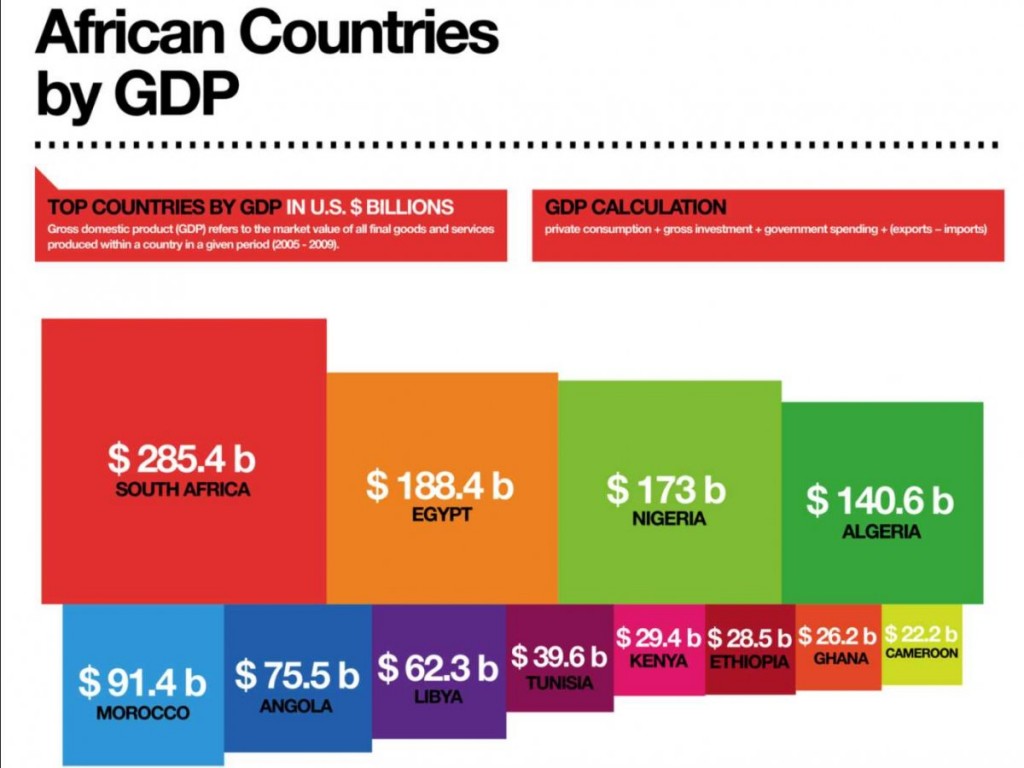
Curious which nations in Africa are the richest? Above you can see by a simple size-graphic which countries are the wealthiest measured by GDP. The relative sizes of the squares show just how much wealthier South Africa is than the other countries, etc. But fair warning, this graphic shows nothing about each nation’s measure of inequality. To do that, the Gini coefficients, which are numbers between 0 and 1 that measure the inequality of an economy, would also need to be included. Though Nigeria has one of the highest GDPs in Africa, its Gini coefficient and inequality is actually fairly high because the vast majority of wealth is concentrated among a select few. Also check out 8 Maps That Will Change the Way You Look at Africa.
9. The World’s Birth Rate Statistics
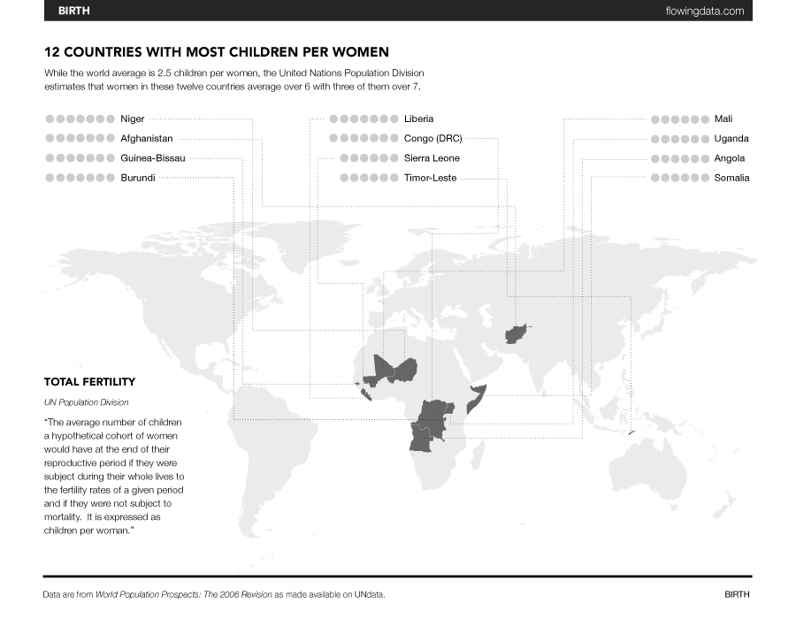
As mentioned above, birth rates are so important because they are some of the best predictors of population growth rates, which in turn have implications for overall welfare. Notice a similarity in the top 12 countries with the highest number of children per woman? All of them except for Afghanistan and Timor-Leste are in Africa. On this link, you can also check out similar graphics on population, education, and energy.
10. The World’s Mortality Statistics
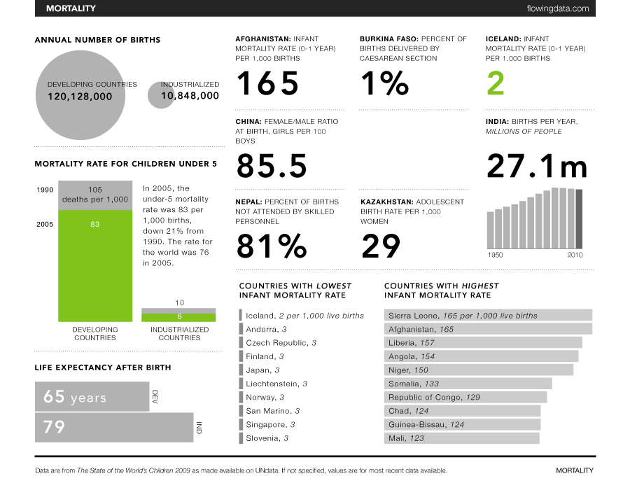
What is another important determinant of welfare and population growth? Certainly mortality rates. While this visualization is a bit of an assault of information, there are a couple important take-aways. On the left, check out the difference in developing countries and industrialized countries for mortailty rates of children under 5, for which the 2005 data is highlighted in green. Then on the bottom right you can see the 10 countries with the highest infant mortality rates, again all of which are in Africa except for Afghanistan.
11. Mapping Internet Against Population

This map is especially cool because not only does it show internet access by the location of IP addresses, but it geo-locates internet access against population size. This shows how huge population centers such as India may be lacking proper internet access (in blue), while other places like Australia and the central United States may have total access to the internet even with small populations (red).
12. Demographics of a 100-Person World
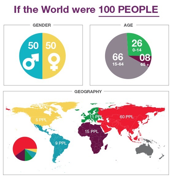
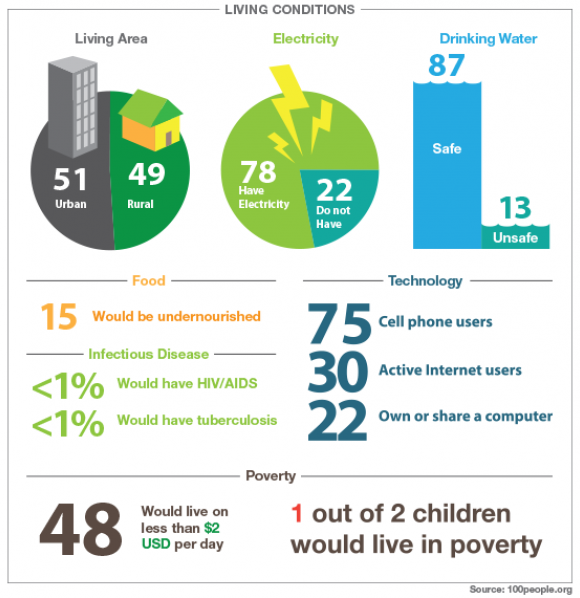
This might be the most simplistic graphic of the bunch, but it is also one of the most explanatory. If we were to imagine that the world’s population was comprised of just 100 people, holding constant the demographics that exist today, we can turn the percentage data of these demographics into hard numbers. This allows us to to see how if the world were made of 100 people, 60 of them would live in Asia, 17 of them would not be able to read, and 13 would not have access to clean water. That’s astounding!
Which graphic did you find most surprising?