We’ve pulled together eight maps that put Africa’s population, income, growth, and potential into context.
1. Where the world’s 7 billion live

National Geographic‘s map illustrates where and how the world lives. Not surprisingly, the areas with the highest income levels have greater life expectancy (77 for males, 83 for females compared to 58 and 60 in low income levels), access to improved sanitation (99 percent compared to 35 percent), among other human security factors. The need for development is critical in sub-Saharan Africa, where nearly 1 billion people live, many on $995 or less a year.
2. How the world would look if it were measured by its wealth, 2015

Using data from the World Bank Development Indicators, Global Finance‘s map shows us what the world will look like in 2015 if it were inflated to the size of their economic wealth. Once again, the need to spur growth in Africa is not just evident, but necessary.
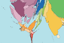
3. Now, the real size of Africa

You likely know the African continent is pretty big, but this new infographic shows us just how big. Created by Kai Krause, it uses some of the largest countries in the world and even all of Eastern Europe as puzzle pieces within the grand continent of Africa.
4. Where the world’s 30 million slaves live

To quote Rajiv Narayan from Upworthy, “Sure 12 Years a Slave won an Oscar, but we all deserve to win Best Actor for pretending slavery doesn’t exist anymore.”
The map above, issued by the Walk Free Foundation stains the world map with reds representing concentrated slavery presence and lighter yellows for lower concentrations. The index considers estimated prevalence of modern slavery by population, child marriage, and human trafficking in and out of a country.
5. Global vegetation

This view of the world’s vegetation presented by NASA clearly depicts the pastoral difference between North and South Africa. There is evidently opportunity for agriculture — in fact, it is twice as effective in reducing poverty as growth in other sectors. But there are other risks to consider in non-pastoral land. Check it out the following map.
6. World water risk

We have a global water crisis. The World Resource Institute dedicated a mapping tool called Aqueduct to help companies, investors, governments, and the public understand the global water stress and risks. Notice the similarities with the previous map now? You should. While there is opportunity for agriculture in sub-Saharan Africa, North Africa, and parts of South Africa face high risk of water scarcity.
7. Global internet usage

On a continent where only 7 percent of its inhabitants are online, this map is an eye-opening illustration of the digital divide. With the internet comes improved access to information, communication, and ideas — and organizations need to make sure to bridge the gap. The good news is that Africa’s telecommunications market is one of the fastest in the world.
8. Energy poverty

Last but not least, this snapshot of the world at night, stitched together with photos from NASA, contrasts with the little access to electricity in Africa compared to the global north. Energy poverty translates to poor health care, stifled economic growth, toxic fumes, limited or no education, and lack of safety.