
2014 was a big year for global development. The Ebola crisis proved why aid and strong health systems in developing countries matter. The growing inequality gap helped put a much-needed spotlight on anti-corruption and transparency. And it was a huge moment for HIV/AIDS – we have now reached a tipping point in the fight against the preventable disease.
With the help of ONE’s excellent policy team, we rounded up the most important development news of the year, from nutrition to energy. Scroll through to catch up on major reports and findings you may have missed:
1. The global under-five mortality rate fell by almost half
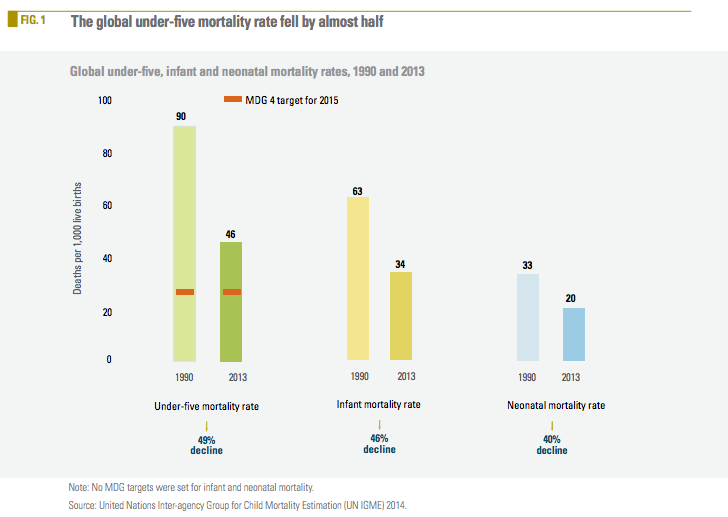
According to a 2014 UNICEF report, since 1990, the global under-five mortality rate has declined by nearly half (49%), from 90 deaths per 1,000 live births to 46 deaths in 2013. This is one of the most significant achievements in human history!
2. Sub-Saharan Africa is still extremely poor
In 2014, the World Bank published the latest global poverty figures. Currently, of the 26 countries where the rate of extreme poverty is over 40%, only two are NOT in sub-Saharan Africa.
3. But global poverty overall is on the decline
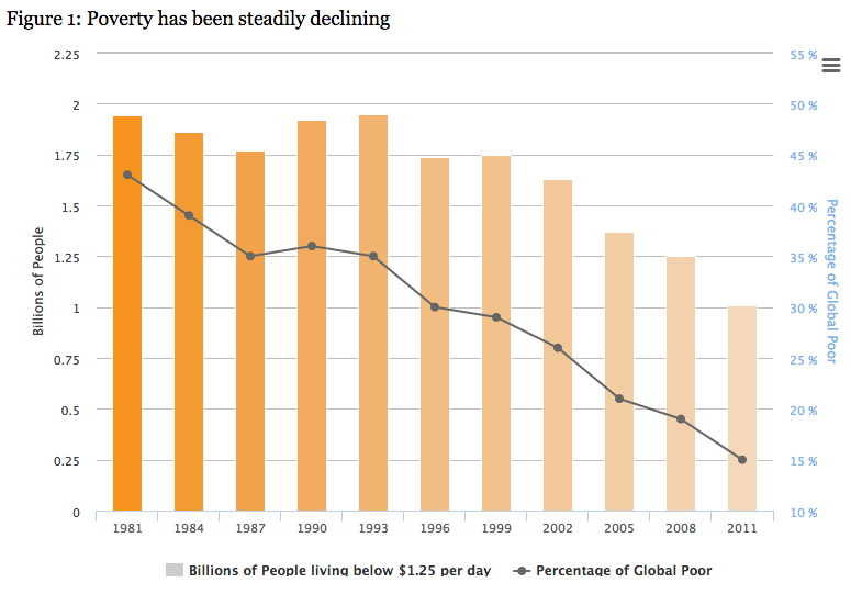
According to the same report, the proportion of people living in extreme poverty (on less than $1.25) has declined by 60% from 1990 to 2011, and now stands at 1 billion (down from 1.9 billion). As a percentage of the entire global population, this is down from 36% in 1990 to 14.5% in 2011.
4. South Sudan rolled out the pentavalent vaccine
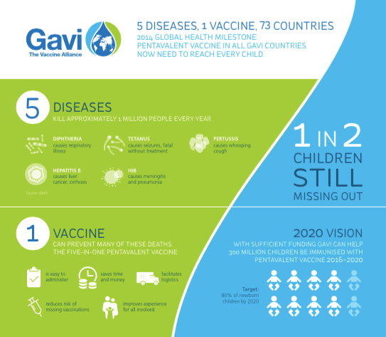
South Sudan launched the pentavalent vaccine in 2014, making it the final GAVI-eligible country to roll out that critical 5-in-1 vaccine, a vaccine we’ve campaigned on for years, including our work in the run up to the Gavi pledging conference in January. This vaccine has saved millions of children’s lives and will continue to do so in the newest country in the world. The graph above shows how the vaccine works.
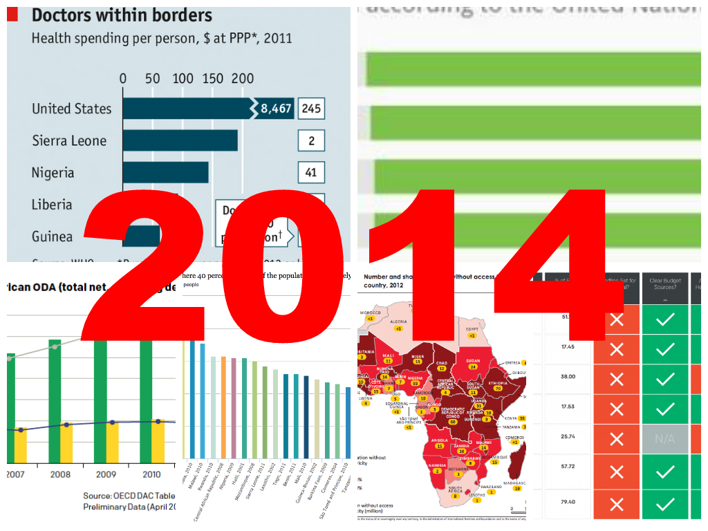
5. The disparity of health care resources in the developed vs. developing world is huge
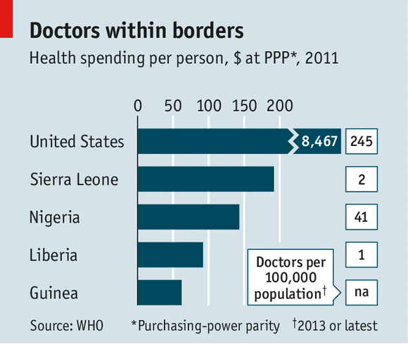
Ebola reinforced the distinction that the affected countries in West Africa don’t have the health care systems needed to effectively end the outbreak (that’s why we’re asking world leaders to step up with their support). This chart from The Economist compares the health spending per person in Sierra Leone, Nigeria, Liberia and Guinea with the US. As you can see, the gap is huge.
6. Pledging aid and disbursing aid mean two different things
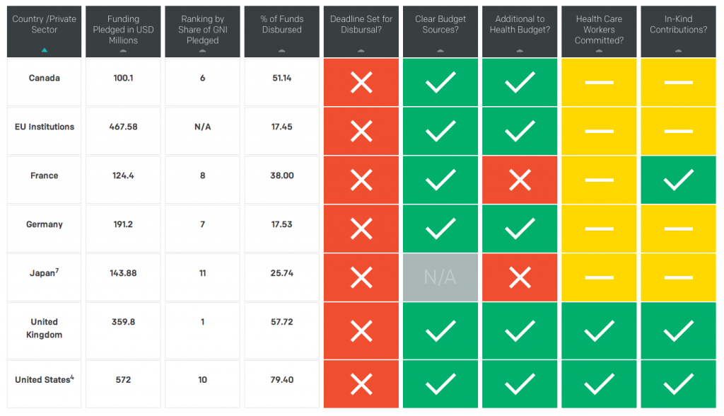
The urgency of the Ebola outbreak taught us to make the distinction between talk and action – because every day the world waits, more people die. This chart, created by ONE as of December 11, shows what funding governments promised in the fight against Ebola, and how much of that funding was actually disbursed. (Click to enlarge)
7. We hit a huge milestone on AIDS
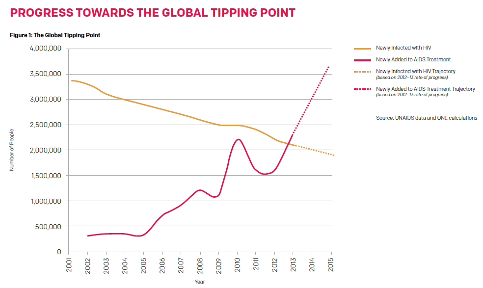
Quietly, beyond the headlines this year, the world achieved something great: we reached a tipping point–“the beginning of the end of AIDS”. This is a global milestone that has taken three decades to achieve–something we’ve never done before in the history of the disease. It means that we added more people last year to life-saving AIDS treatment than the number of people who became newly infected with HIV in the same year. But this progress is fragile, and we need to shore up support for AIDS to make sure we don’t backtrack.
8. Overseas aid increased slightly last year, but not to the poorest countries
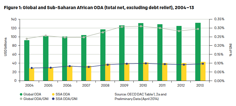
Official development assistance stood at $134.8 billion in 2013, reversing the decline of the previous two years and registering the highest aid levels recorded. Despite that, aid is shifting away from the poorest countries. 80%of imports from developing countries entered developed countries duty-free and tariffs remained at an all-time low. The debt burden of developing countries remained stable at about 3% of export revenue.
9. …With Ireland leading the pack on aid to least developed countries
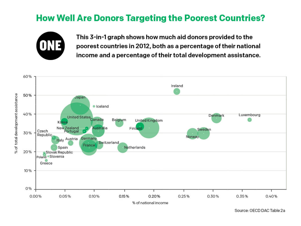
At a time when most donors are far from reaching their aid targets, and in 2012, collectively gave less than a third of their total aid to the poorest countries, one country stands out from the pack: Ireland. Ireland didn’t just give one-third but a full half to least developed countries in 2012.
10. Norway has the highest human development, while Niger has the lowest
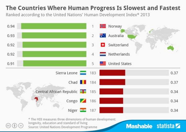
While the UNDP’s 2014 Human Development Report indicates improvement and progress overall, it found that more than 2.2 billion people are near or living in multidimensional poverty, with 1.2 billion people currently living on less than $1.25 per day (As you’ll remember from #5 above, the World Bank’s most recent figures put this figure at 1 billion). The graph above depicts country breakdown of the top and bottom 5 countries.
11. Too many countries in Africa do not have access to reliable electricity
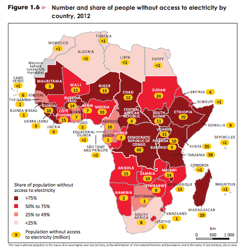
Energy poverty in sub-Saharan Africa was a major campaigning issue for ONE this year, and this 2014 chart from the International Energy Agency explains why. Over two-thirds of sub-Saharan Africa’s population (more than 620 million) live without electricity. Making this even more alarming, 730 million use other more dangerous types of cooking fuel – biomass like wood and charcoal.
12. We don’t have enough data on nutrition
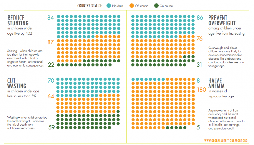
At a 2012 meeting of the World Health Assembly, all UN members committed to achieving global nutrition targets by 2025. So far, the number of countries on course to meet the global targets is too low. Many countries, in fact, don’t even have the data to evaluate their progress against the targets.
13. Where we do have nutrition data, it shows progress
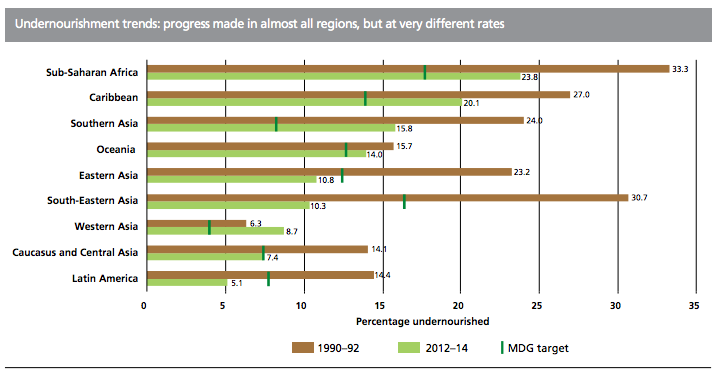
The data we do have on nutrition shows that we have made progress on battling undernourishment in all regions of the world. Knowing where and how progress has been made lets policymakers make better choices on what to do now.
14. Denmark is seen as the least corrupt country
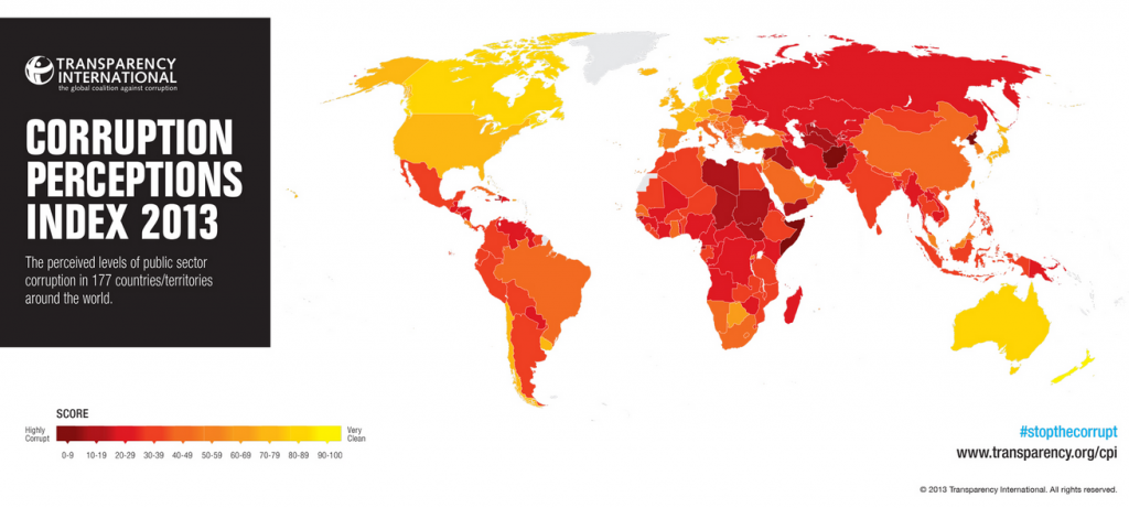
Transparency International’s 2013 Corruption Perceptions Index map, released this year, assesses the prevalence of corruption in countries across the world. Here’s a summary of the findings of its 2013 index.
Special thanks to ONE’s global policy team for sharing these findings with me.
